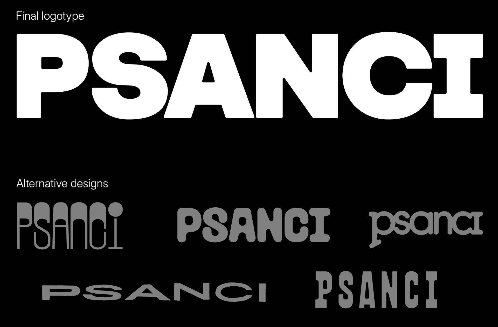
PSANCI
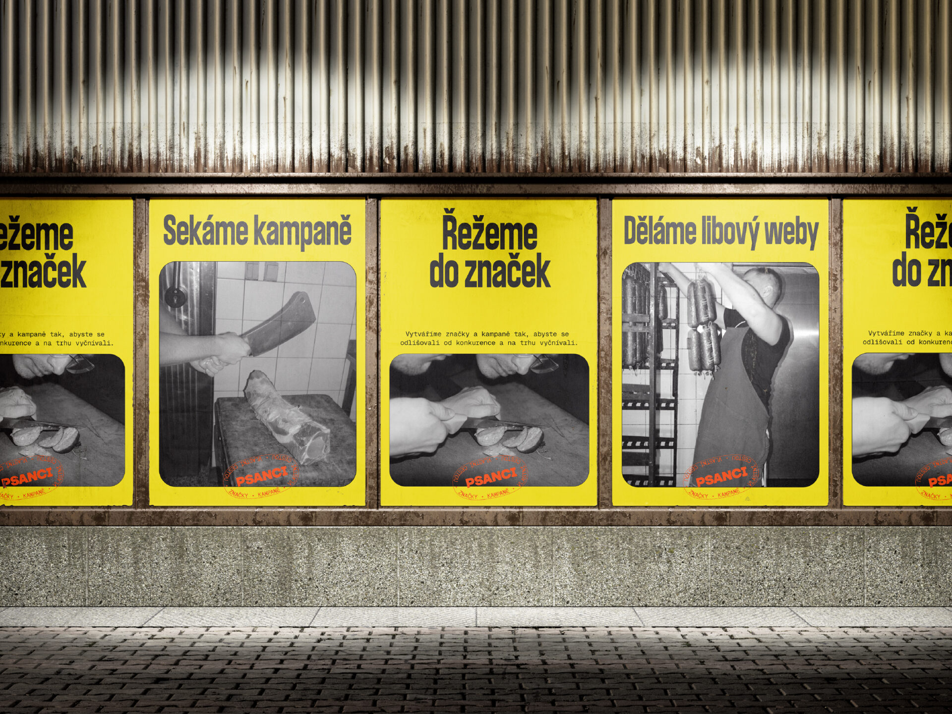
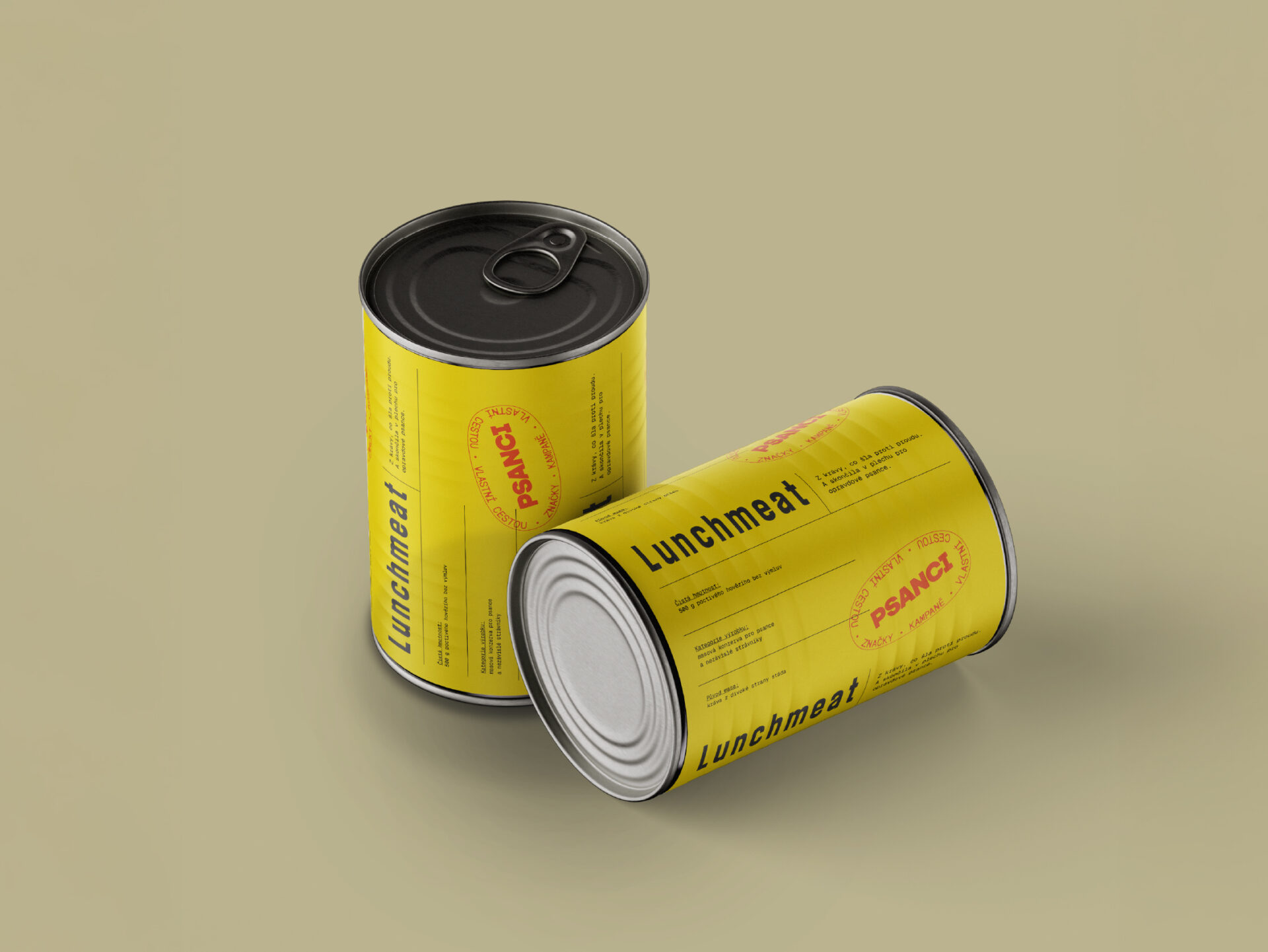
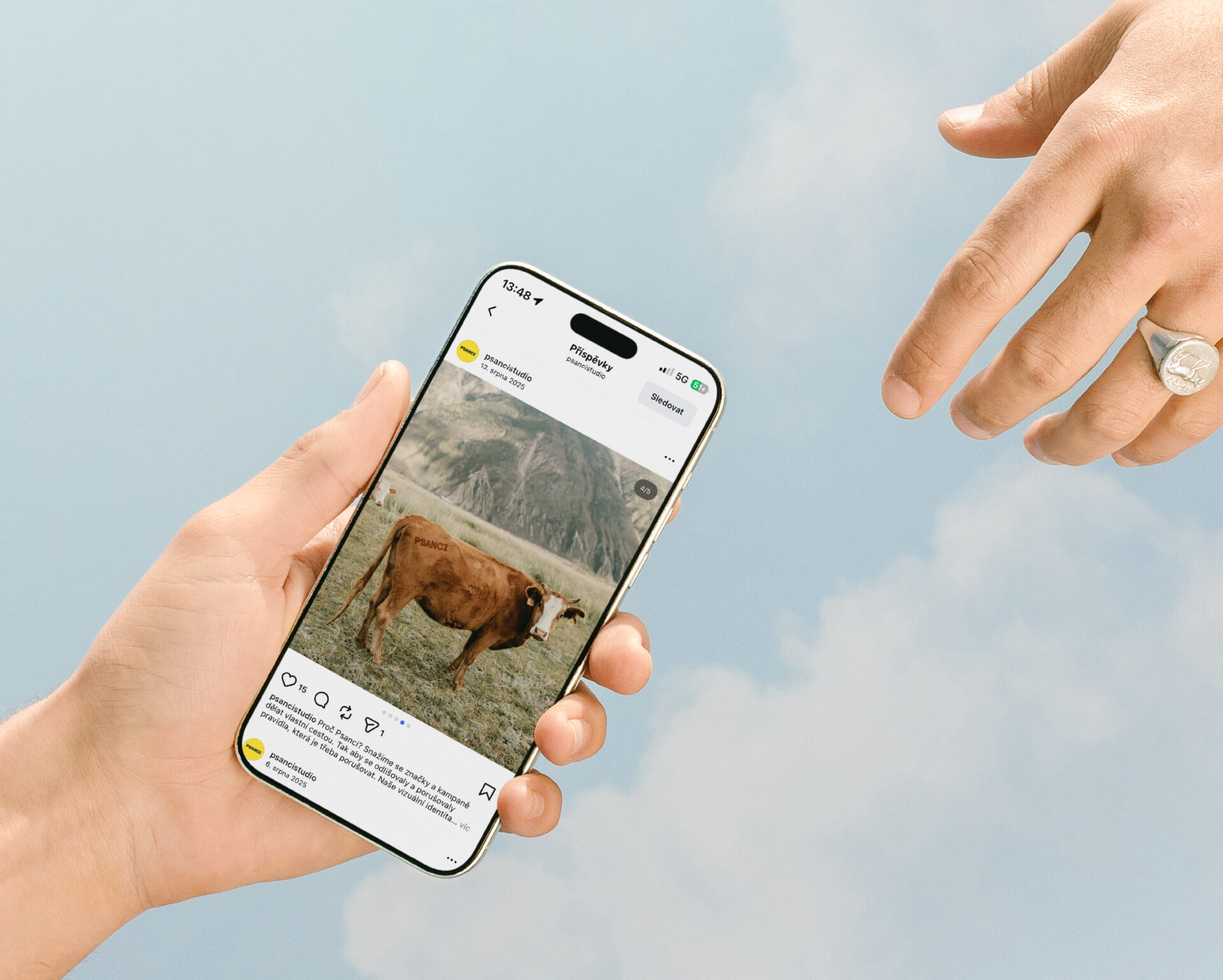
Designing a visual identity for an agency somewhere between a western herd of cows and a dirty butcher’s cleaver in raw meat was a very specific challenge.
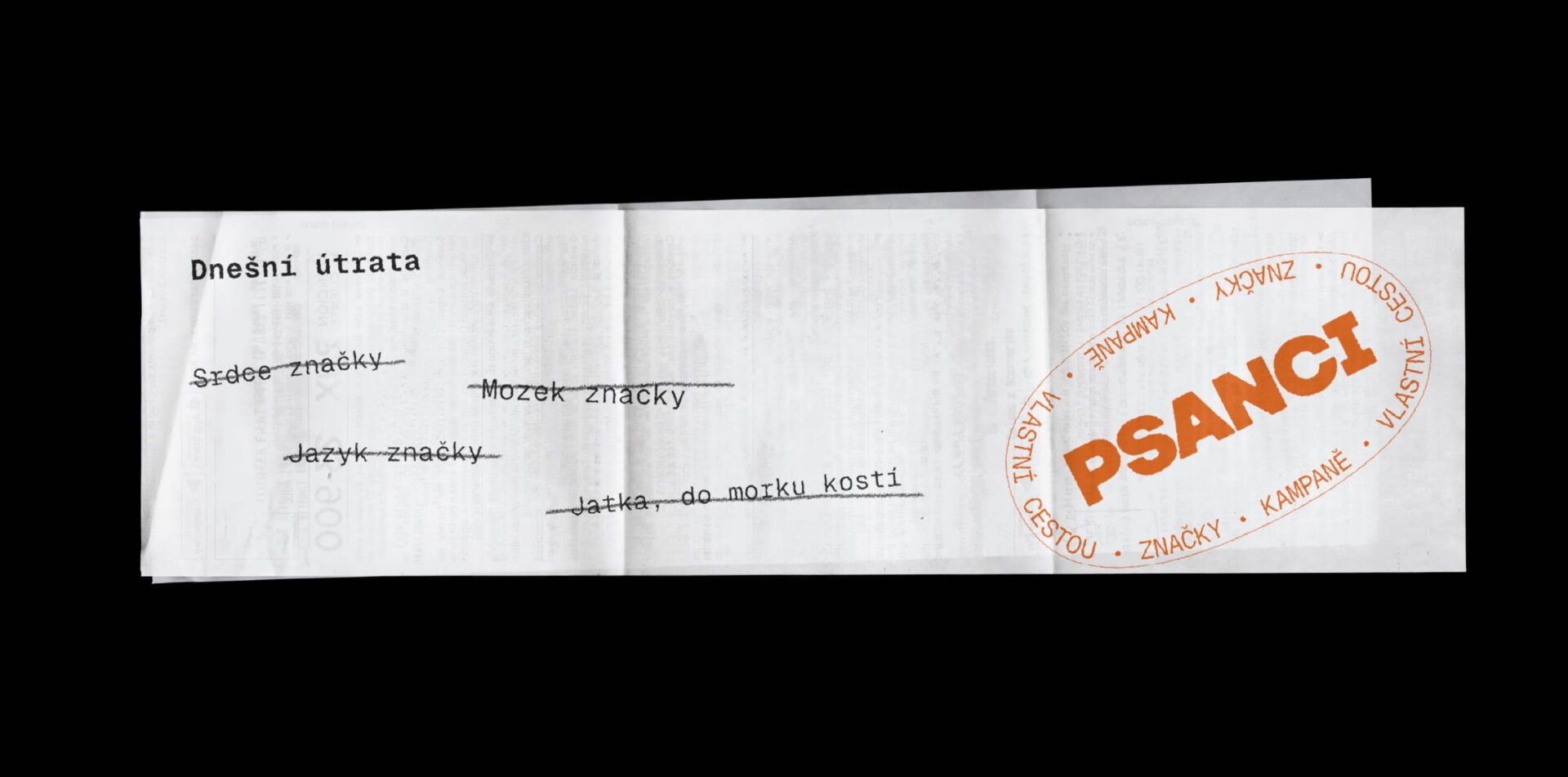
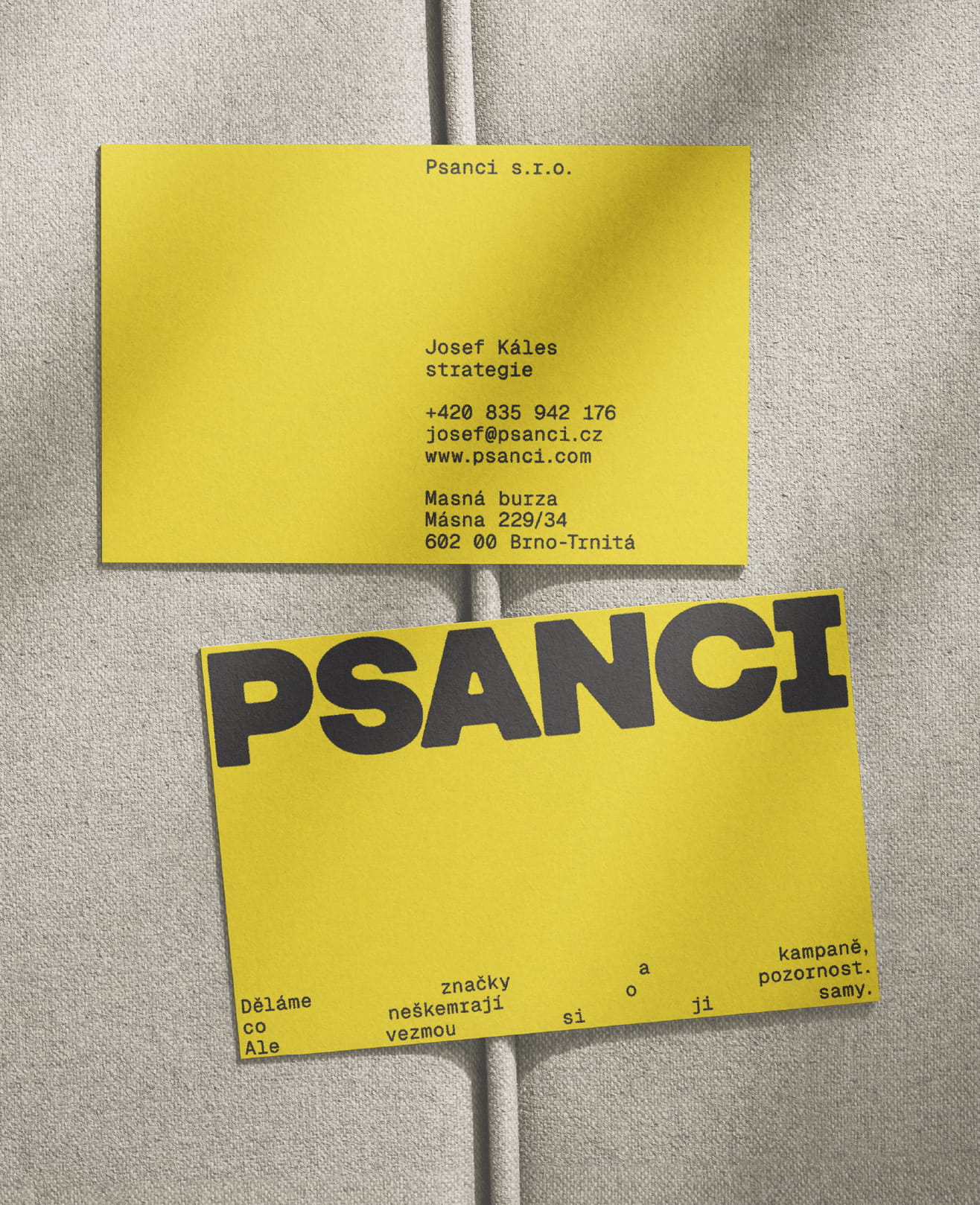
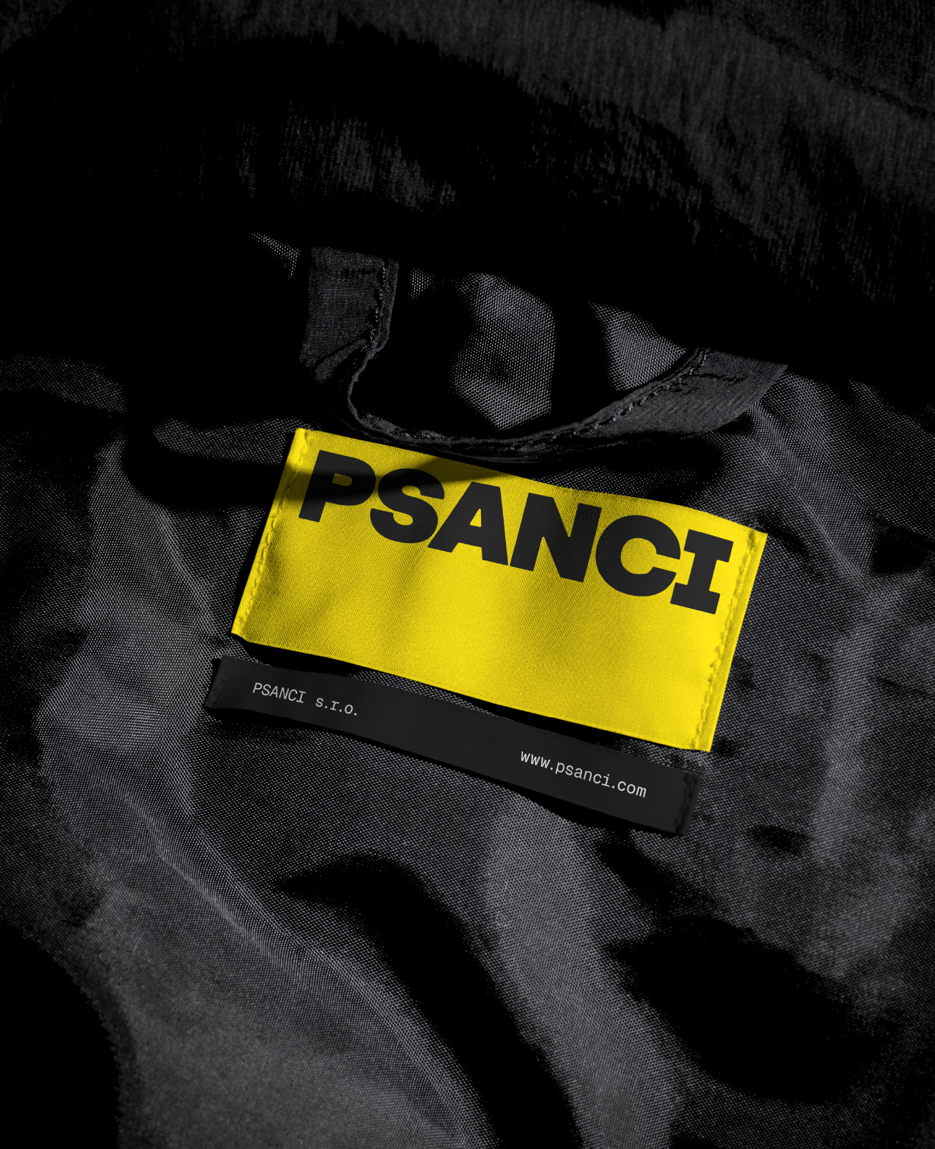
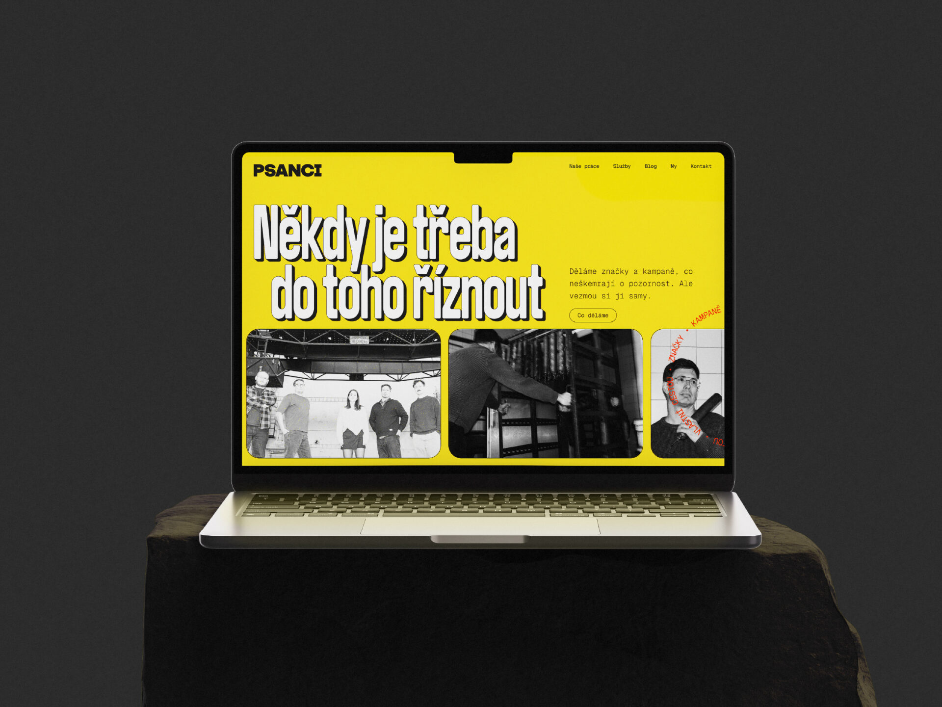
I approached it in a modern way with an intentionally archaic edge. The main archetype is a rebel or outlaw, mixed with humour and clear exaggeration. As always, I started with typography and the logo. After testing several directions, I chose a strong, distinctive and deliberately static logo that feels slightly macho, in line with the outlaw attitude.
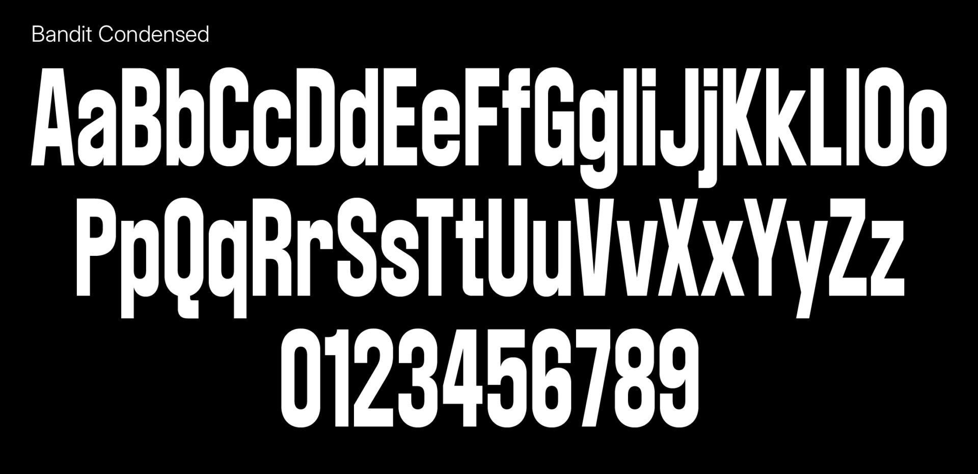
The main headline typeface is Bandit by AllCaps Type Foundry.
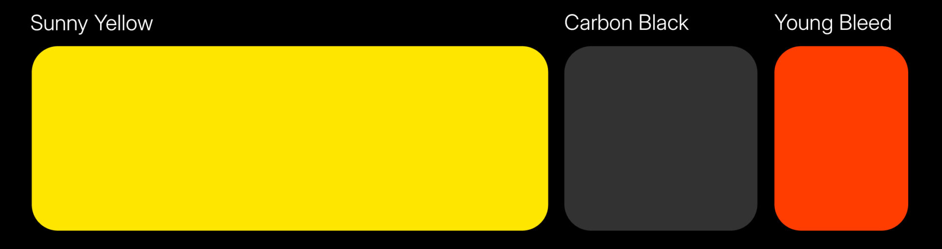
The colour palette is bold and simple. The main colour is a bright, warm yellow. Purple was originally considered, but was replaced with a more natural red, used mainly for stamps. Black completes the palette and connects directly to the black and white photography used across the identity (more about photography here).
The identity was created in collaboration with Josef Káles (strategy and copywriting).
Designed in February 2025.
The identity is still in use.