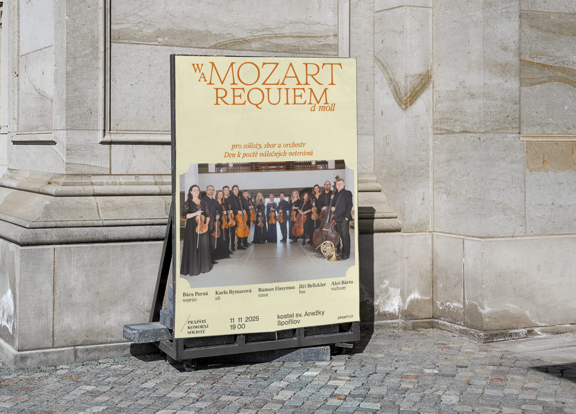
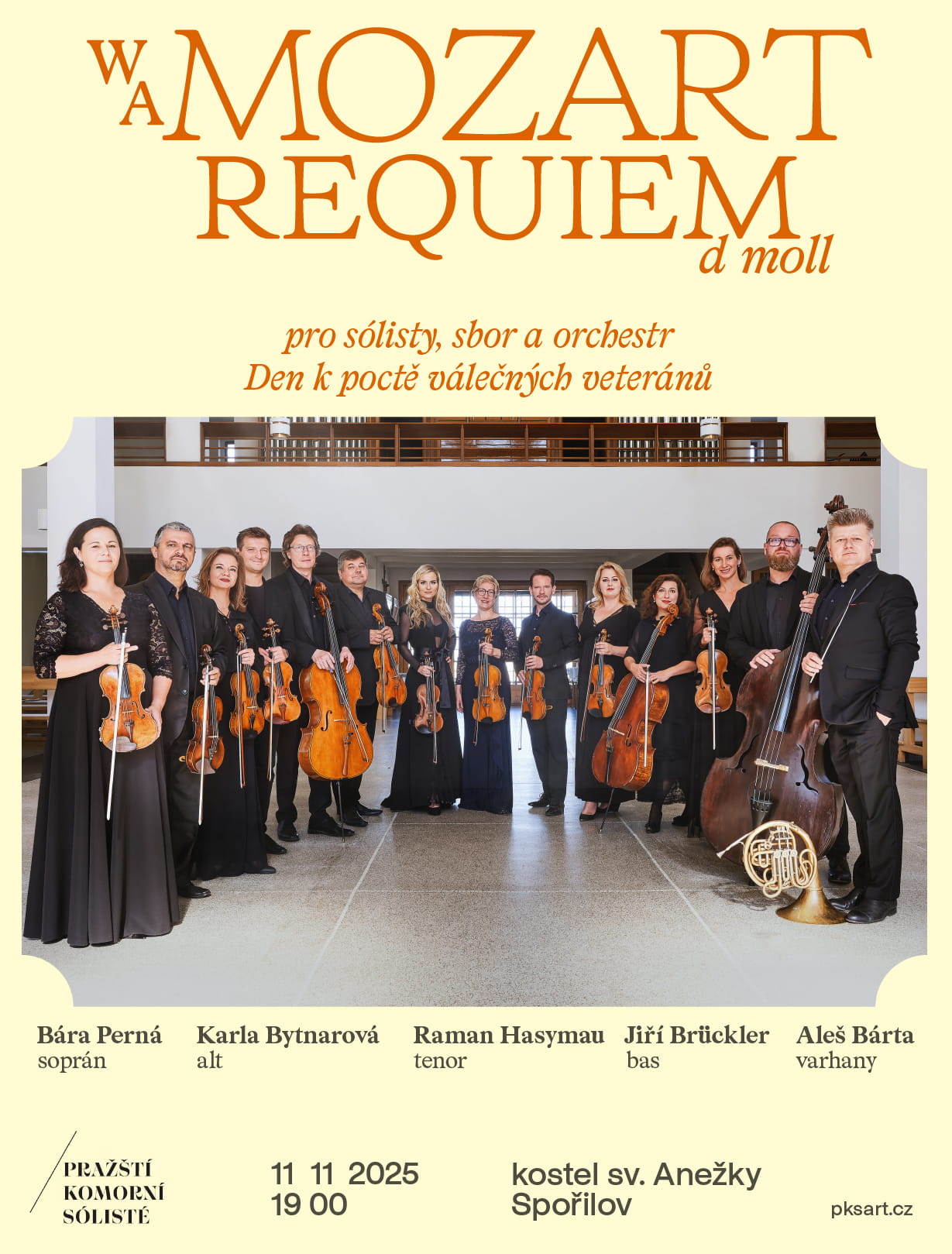
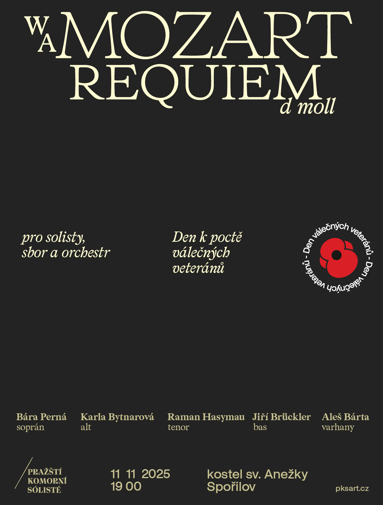
Prague Chamber Soloists – Mozart
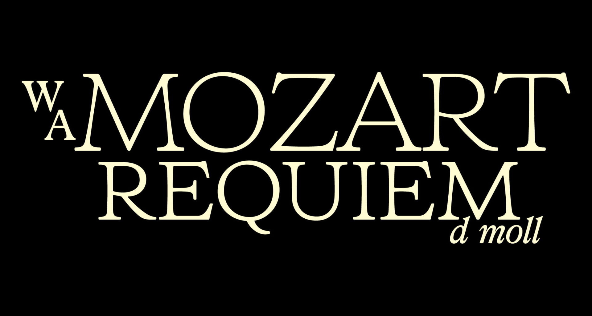
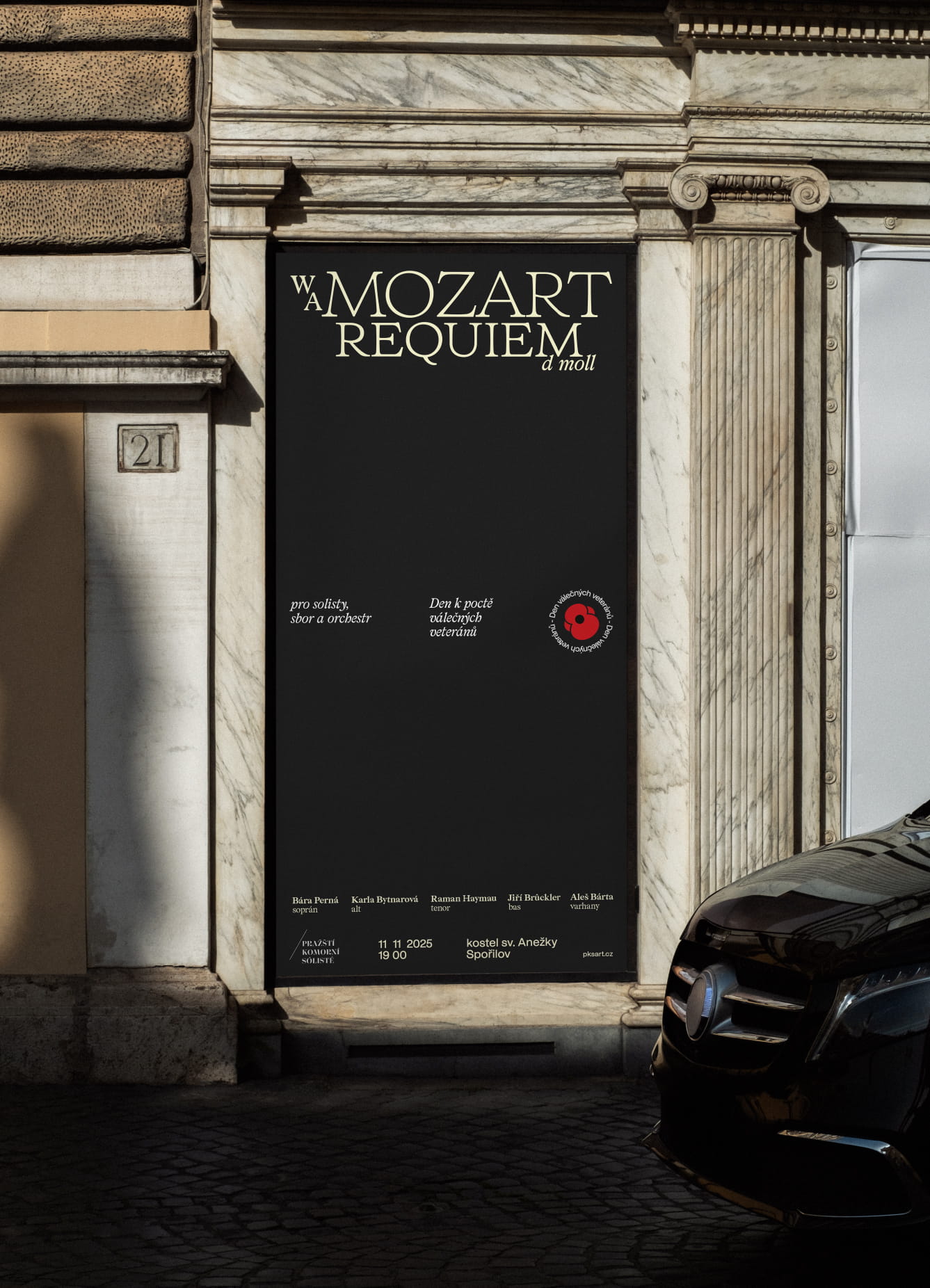
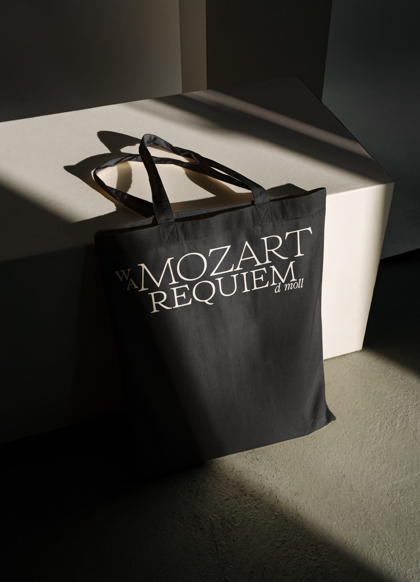
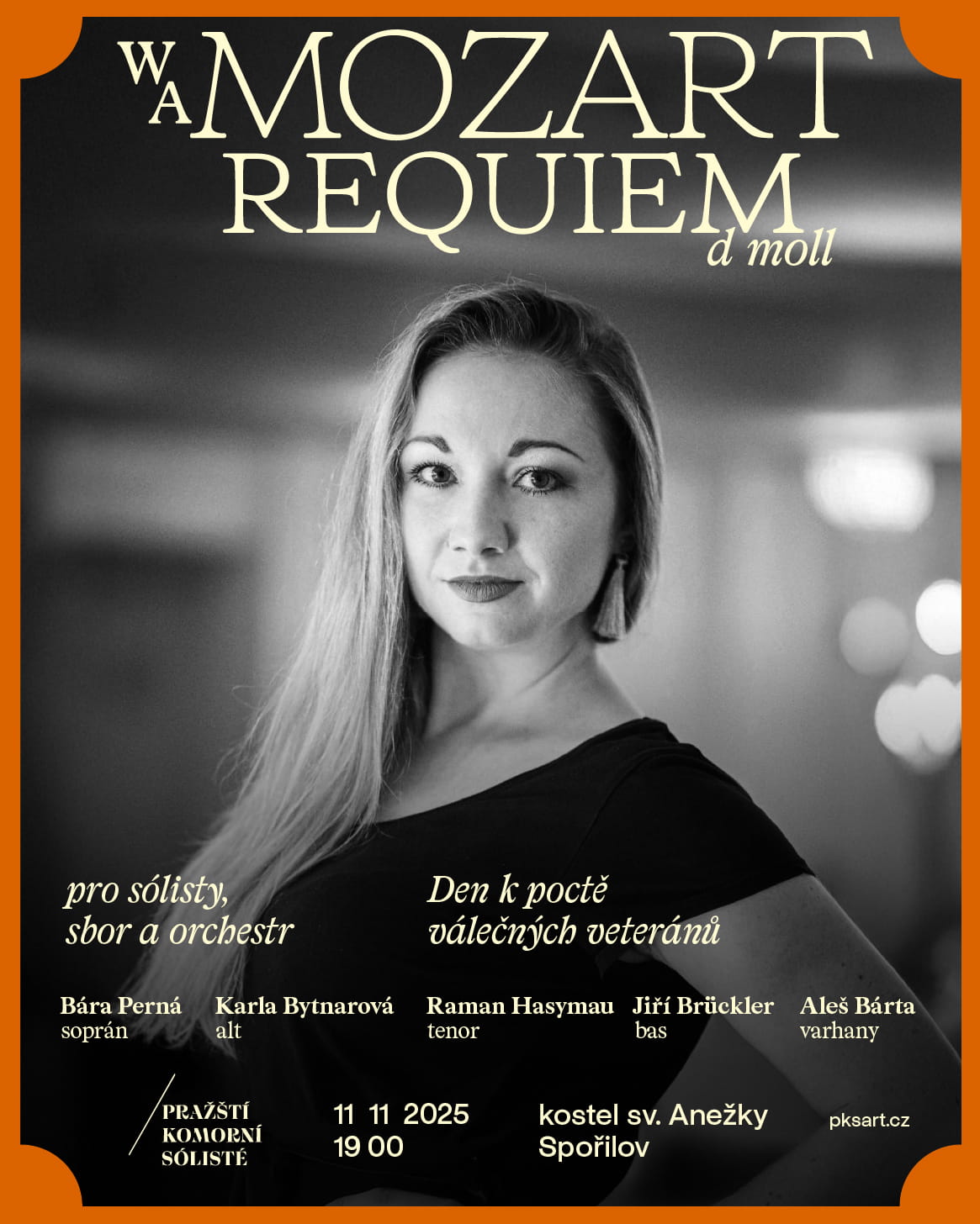
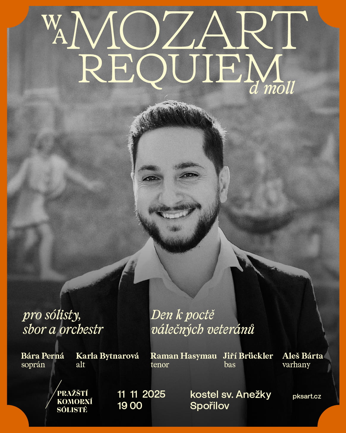
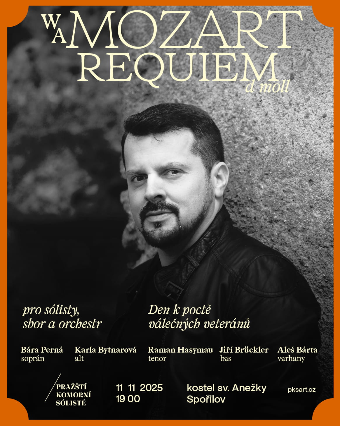
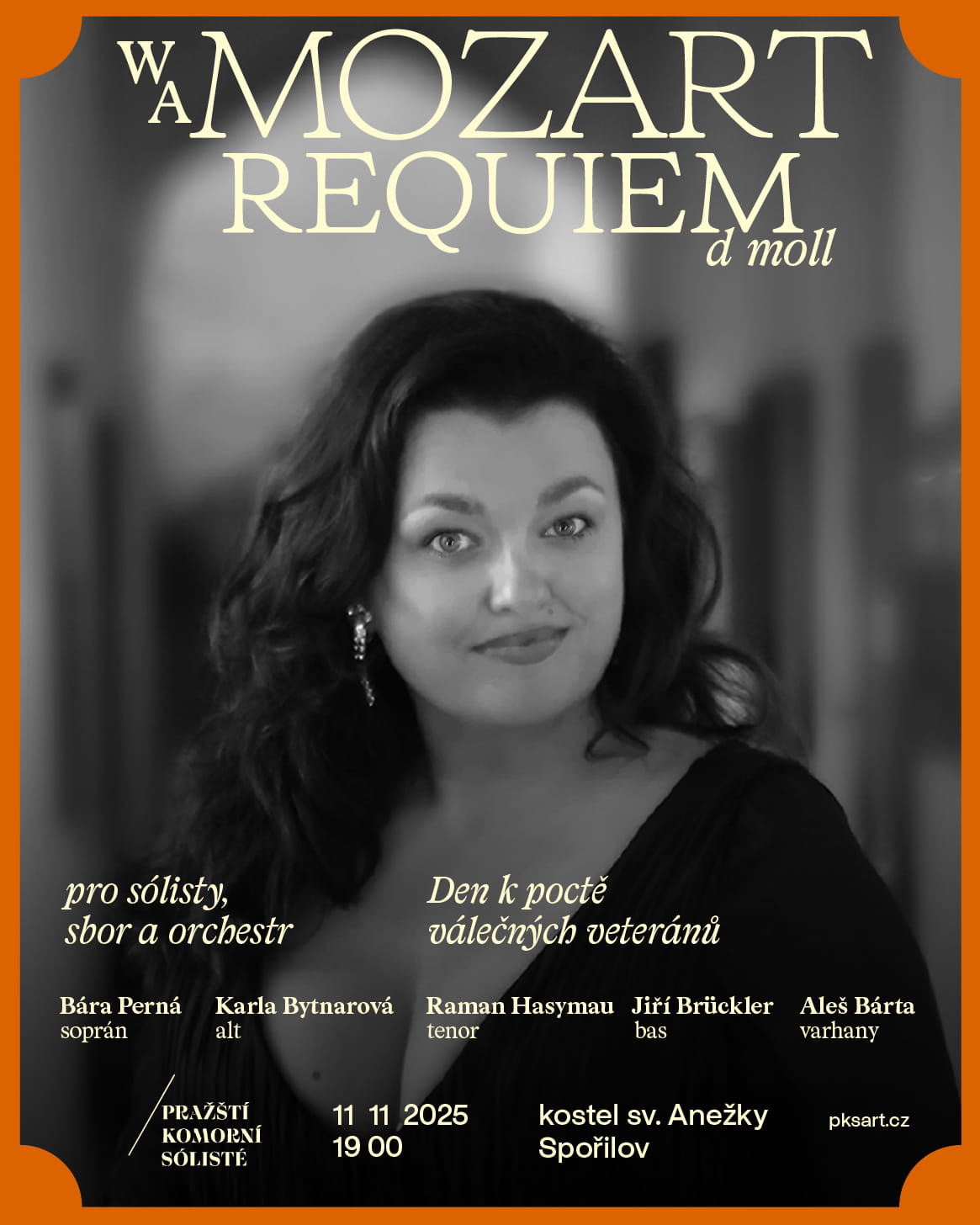
When designing a mini visual identity for a memorial concert by the Prague Chamber Soloists, I once again let typography take the lead.
Because Wolfgang Amadeus Mozart belongs to the classical period, I softened the typeface by removing the volutes and slightly rounding the serifs. The letterforms became lighter, calmer and a little more organic. My main inspiration came from historical drawings of early serif typefaces.
Alongside the custom typography that connected all concert materials, I worked with three colours: a gentle cream, a slightly bolder orange reflecting the autumn setting of the concert, and of course black as the colour of mourning.
The concert took place on November 11 and was dedicated to war veterans. The singers had designed profiles with black and white photographs, which naturally echoed the overall colour concept.
The informational text uses the Prabhupada Book and Italic typefaces.
Designed and used in 2025.